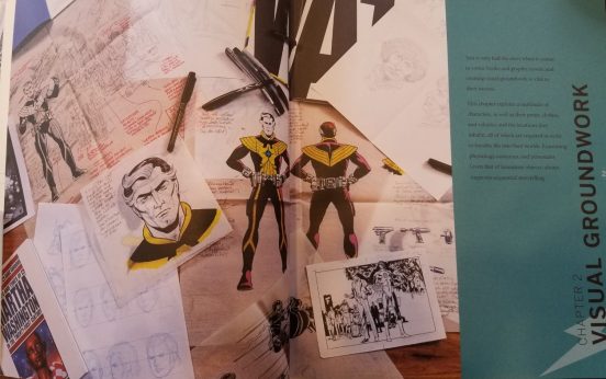
This week, I whipped out some pencils, pens, fine tipped markers and got down to the business of designing my comic book design. As Gibbons and Piltcher remind us, “Text is only half the story when it comes to comic books and graphic novels, and creating visual groundwork is vital to their success” (27).
In their chapter on “Visual Groundwork,” Gibbons and Piltcher describe some of their favourite techniques for crafting graphic worlds, maintaining visual consistency, and giving characters distinctive appearances. Something I will have to keep in mind during my design process are my limitations as a graphic artist. While I may have a knack for drawing cartoons, I still lack the necessary practice to draw quickly or using complex perspectives. As such, it will be key for me to take Gibbons and Piltcher’s tips concerning simplicity of character design, as well as, capitalizing on a few other drawing tricks to keep their features distinctive.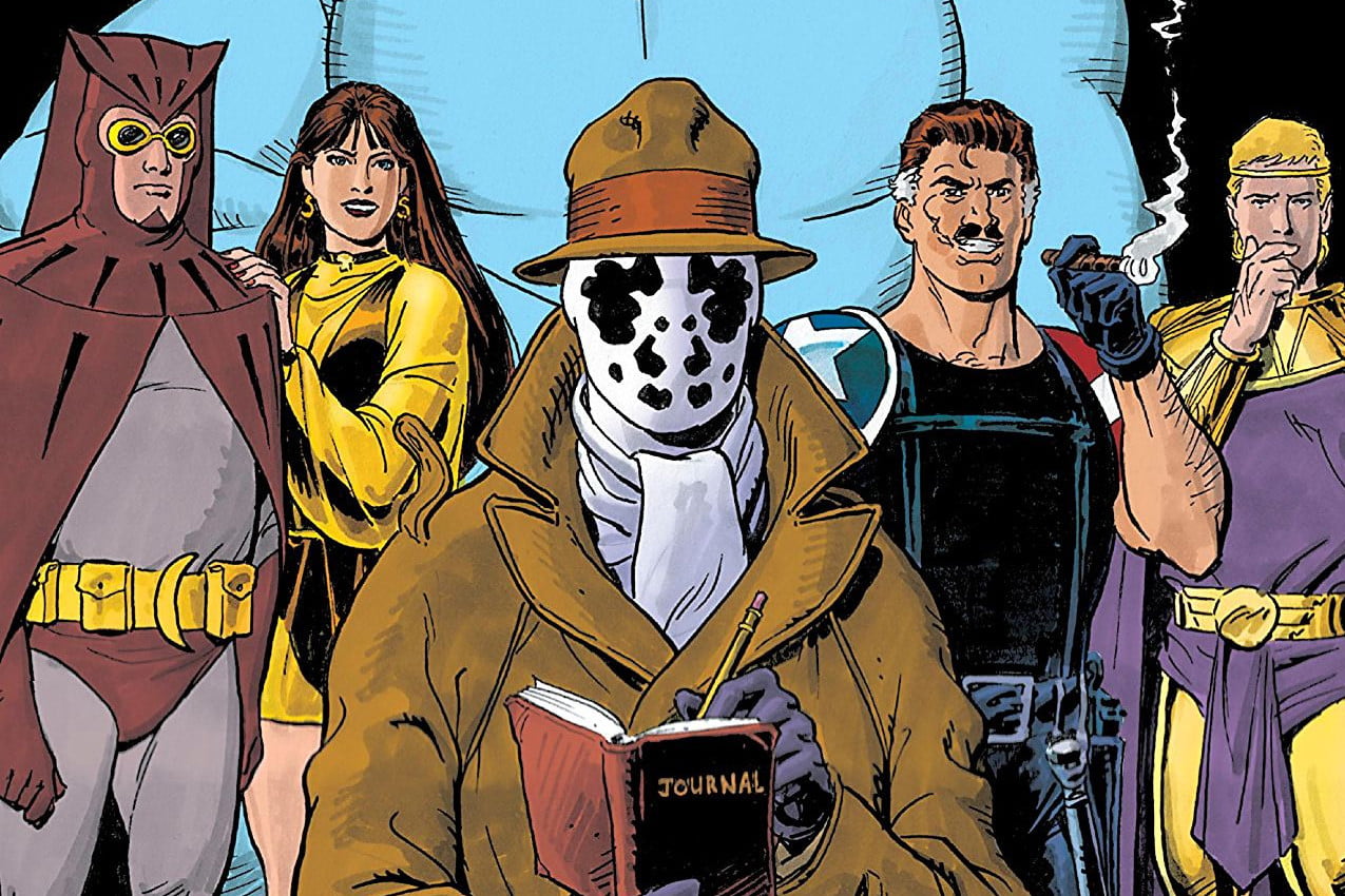
In Watchmen, for instance, Gibbons anticipated the demands of Allan Moore’s panel design, which called for all sorts of graphic angles. He thus “went to a lot of trouble to give the characters different builds and contrasting facial features” (36). In this way, Gibbons ensured that from panel to panel he could keep characters consistent and distinguish them from each other. The last thing the reader wants is to lose track of who’s-who in the midst of a complex panel.
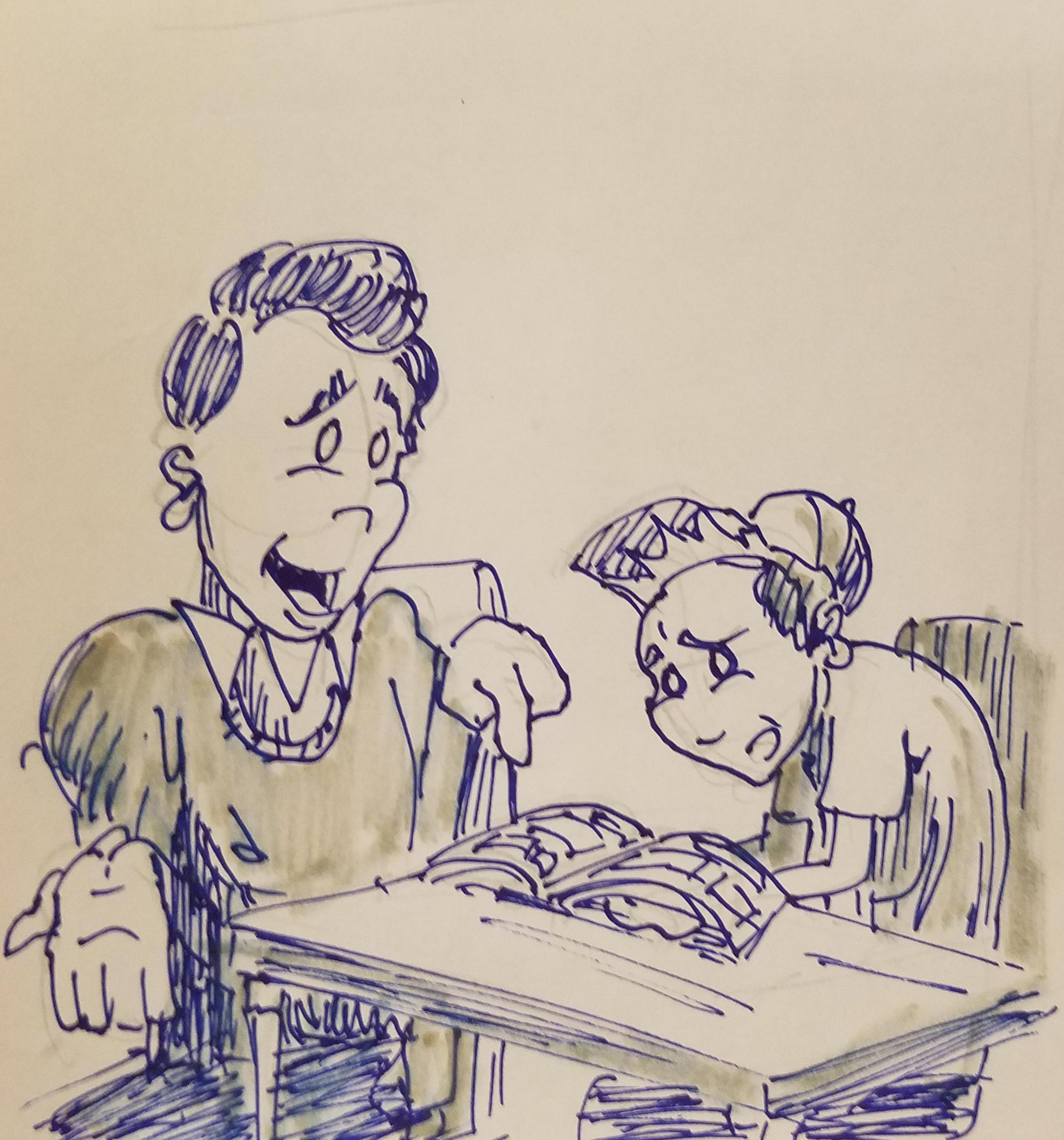
For my comic book, my characters include myself, the high school student I interviewed and some of his friends. I’ve tried to keep their character designs simple and distinctive, but also to include some of their personalities into their overall look.
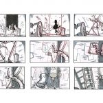
Next week, I’ll start with my comic’s storyboarding! Stay tuned.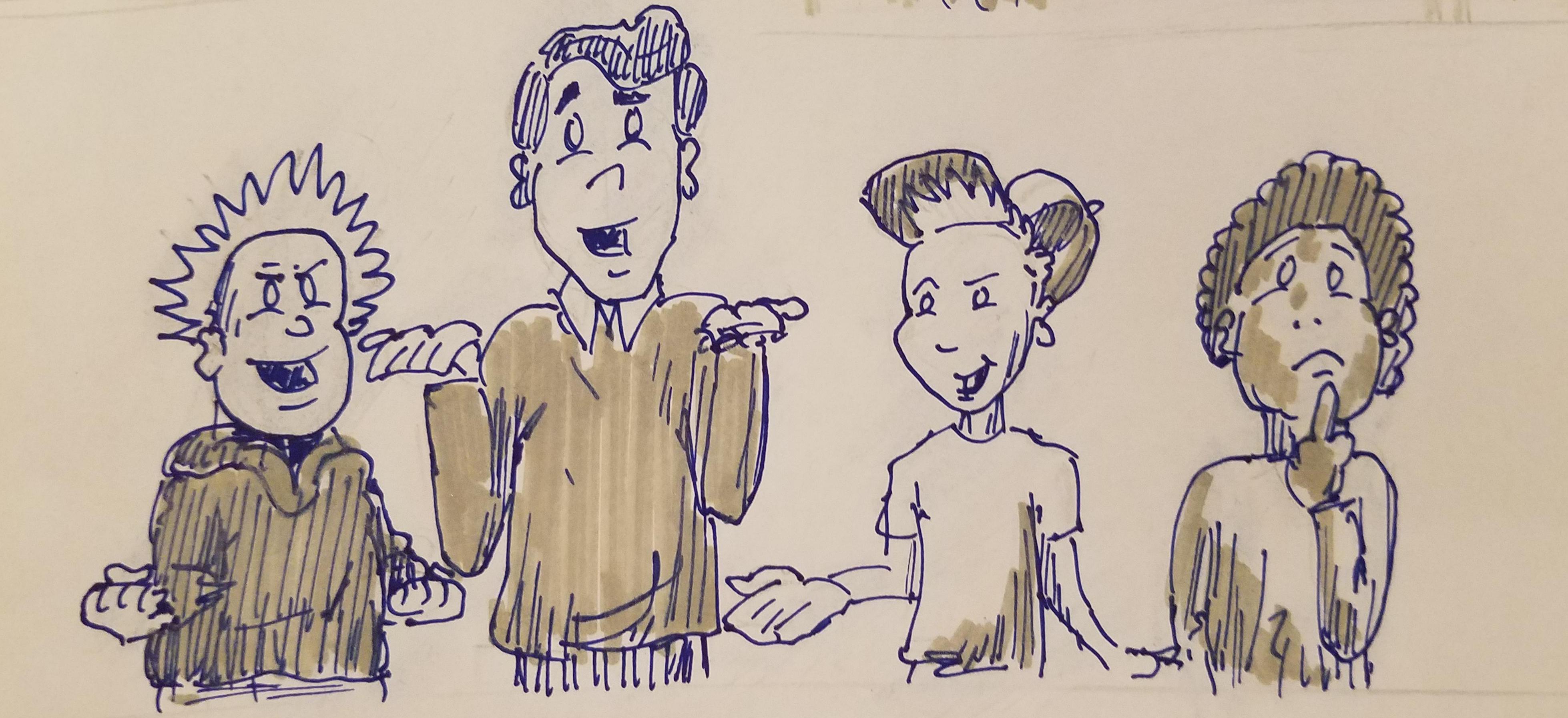


Comments by gboldt
Podcasts and Pedagogy
Haha I haven't uploaded it quite yet. It should be ...