“There’s a million books on how comics are put together; but none from the master storyteller behind the greatest graphic novel of all time. This is Orson Welles giving you a movie tutorial. If you’re serious about this business, this should be sitting on your desk.”
–Mark Miller
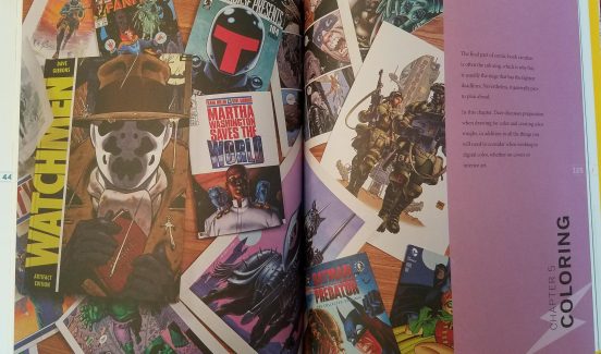
This week, I put on a pot of coffee and sat down to read Dave Gibbons and Tim Piltcher’s book How Comics Work. Suffice to say, one coffee pot was not enough.
The book is an engaging romp through Gibbons and Piltcher’s combined 70 years of experience in the comic book industry. Both designers have worked at virtually every level of comic book creation, from publishers to lettering jockeys, but both are perhaps best known for their illustrations—and WHAT illustrations!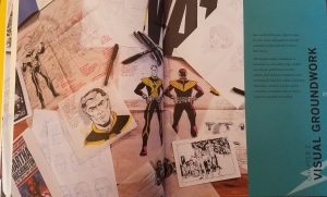
I must admit, I spent nearly half my time simply drinking in the sheer array of dynamic images. From superheroes to 16thcentury French explorers, the works of Gibbons and Piltcher include a vast array of characters, motifs and settings. Indeed, the two designers have seen it all and, as such, when it comes to advice, the two really know their stuff. As the dustjacket brags,
“Opening his extensive vaults, containing scans of his original artwork, sketches, and rarely seen illustrations of Gibbons’ techniques, readers learn how to create character design from preparatory sketches, use initial designs to understand page and panel layouts, discover handy tips for lettering, and learn the secrets of successful writing with sample scripts” (HCW).
Gibbons and Piltcher break comic book design down into roughly 5 steps:
- Scriptwriting—From mind maps to the written script, this chapter concerns the birth of your story and the dialogue that carries it (9—25).
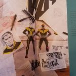
- Visual groundwork—“This chapter explores a multitude of characters, as well as their props clothes, and vehicles, and the locations they inhabit, all of which are required in order to breathe life into their worlds” (26—53).
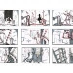
- Sequential storytelling (or storyboarding and drawing)—“In this chapter, Dave reveals both traditional and digital methods of developing comics page, from interpreting scripts, drawing out thumbnails and roughs, and designing page layouts, through the pencils and inking stages, and then, finally, preparing for printing” (54—99).
- Lettering—In this chapter, Dave and Piltcher consider the limitations and possibilities of comic book wording, titles and speech bubbles (100—123).
- Colouring—“In this chapter, Dave discusses preparation when drawing for color and creating color roughs, in addition to all the things you will need to consider when working in digital color, whether on covers or interior art” (124—149).
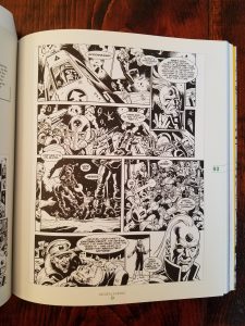
Gibbons and Pilcher organize their creative processes this way, because they found it best to work from the abstract and grow progressively particular. Each stage in the process provides a scaffold for the next to be built upon—informing, guiding and simplifying (or complicating) its development. Much like in PSII’s Inquiry Strategy, Gibbons and Piltcher’s method also includes a lot of cyclicality, that is, they encourage comic book creators to allow new stages in their book’s development to influence the old ones. For instance, say you get to storyboarding and only then realize that your superhero’s costume design is too detailed and a pain to reproduce. Gibbons and Piltcher argue that this is all part of the process. Professional designers must constantly allow the demands of their current design stage to edit their previous decisions. In this way, comic book designers are always refining, developing, enhancing their initial ideas into a tighter (more realistic) finished product. In this example, the comic book illustrator would have to design a simpler costume, which might make for a less engaging hero costume but it might also free up time and space for other interesting graphic flourishes.
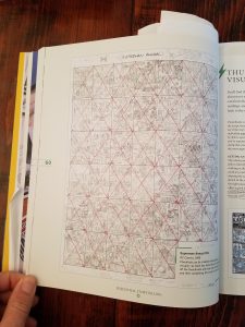 I can’t help but wondering how this process could be used in my future English classrooms? Perhaps, I could assign students a controversial question about the text we’re studying and ask them to explore that query through their own short comic strips. As we see with Gibbons and Piltcher’s design strategy, the process of comic book creation requires preliminary ideas to go through multiple stages of planning, refining and media transition before they emerge as a completed graphic narrative. Through the constant transition—between writing, drawing, colouring, editing—students will be encouraged to think about their topic in new ways and, with the limitations of time and resources, forced to condense their ideas into a refined product (or thesis). But, perhaps the key learning feature this strategy relies on, and as the educators as High Tech High have argued, students learn better and more deeply when they care about what they’re producing.
If my future students don’t take to essay writing, maybe a dose of comic book design is just what the doctor ordered?
